
Making a New Kitchen Feel at Home in an Old House
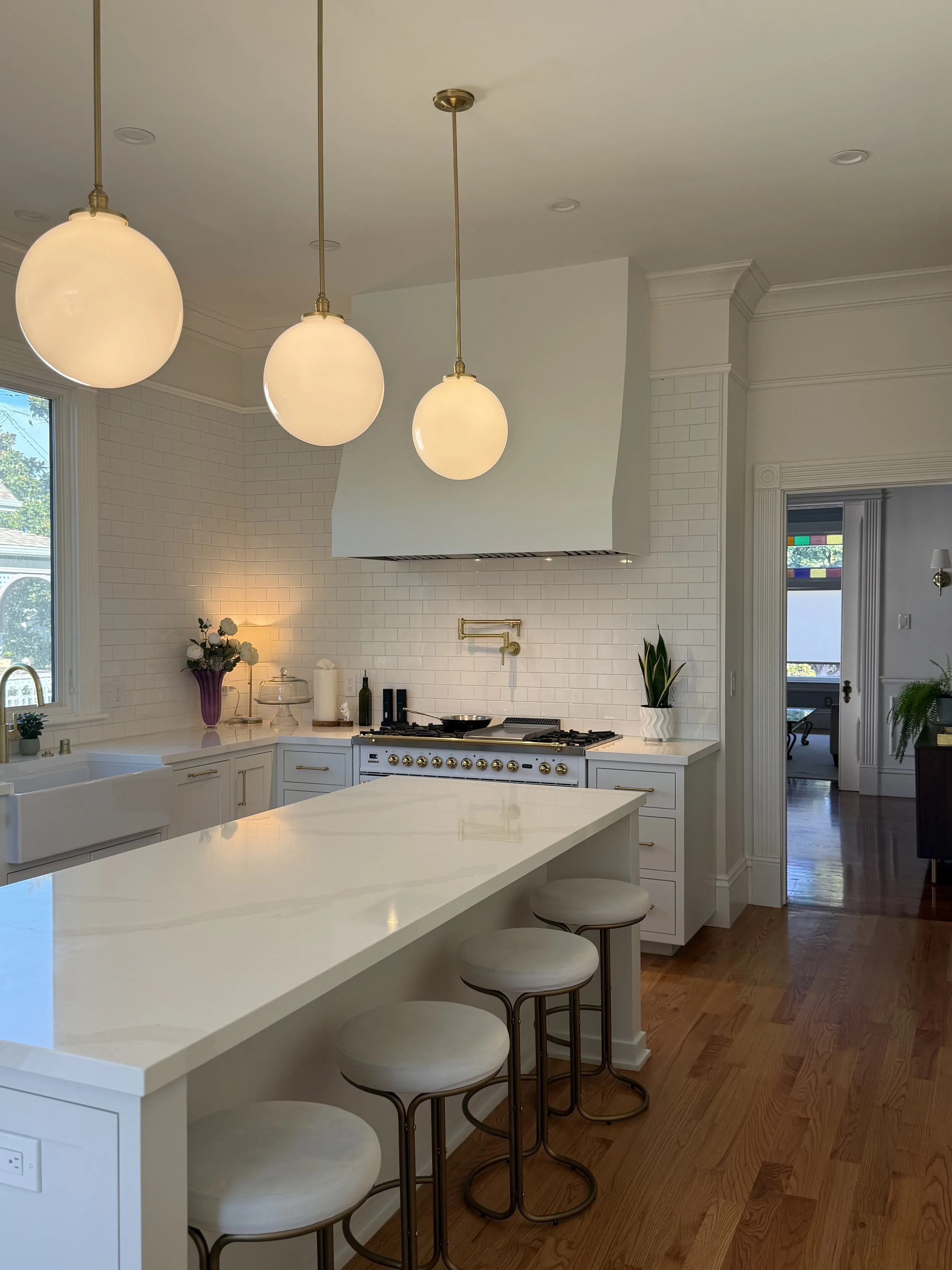
The first thing we did to our kitchen was paint it white.
It was a quick fix. When we moved into our 1900 house, the kitchen was dark with wood-paneled walls, wood cabinets, dark trim and a small white stove tucked beneath cabinetry that stopped far below the over ten-foot ceilings. It felt dated, but not in a way that seemed connected to the age or character of the house.
But the room itself was wonderful. It was large and open, with so much possibility. From the beginning, I was excited by what it could become.
It wasn’t the darkness itself that bothered me. I love a deep green kitchen and i’m very drawn to those moody, old fashioned ones. What bothered me was that the kitchen itself seemed out of step with the room around it. Everything felt too small for the scale of the space.
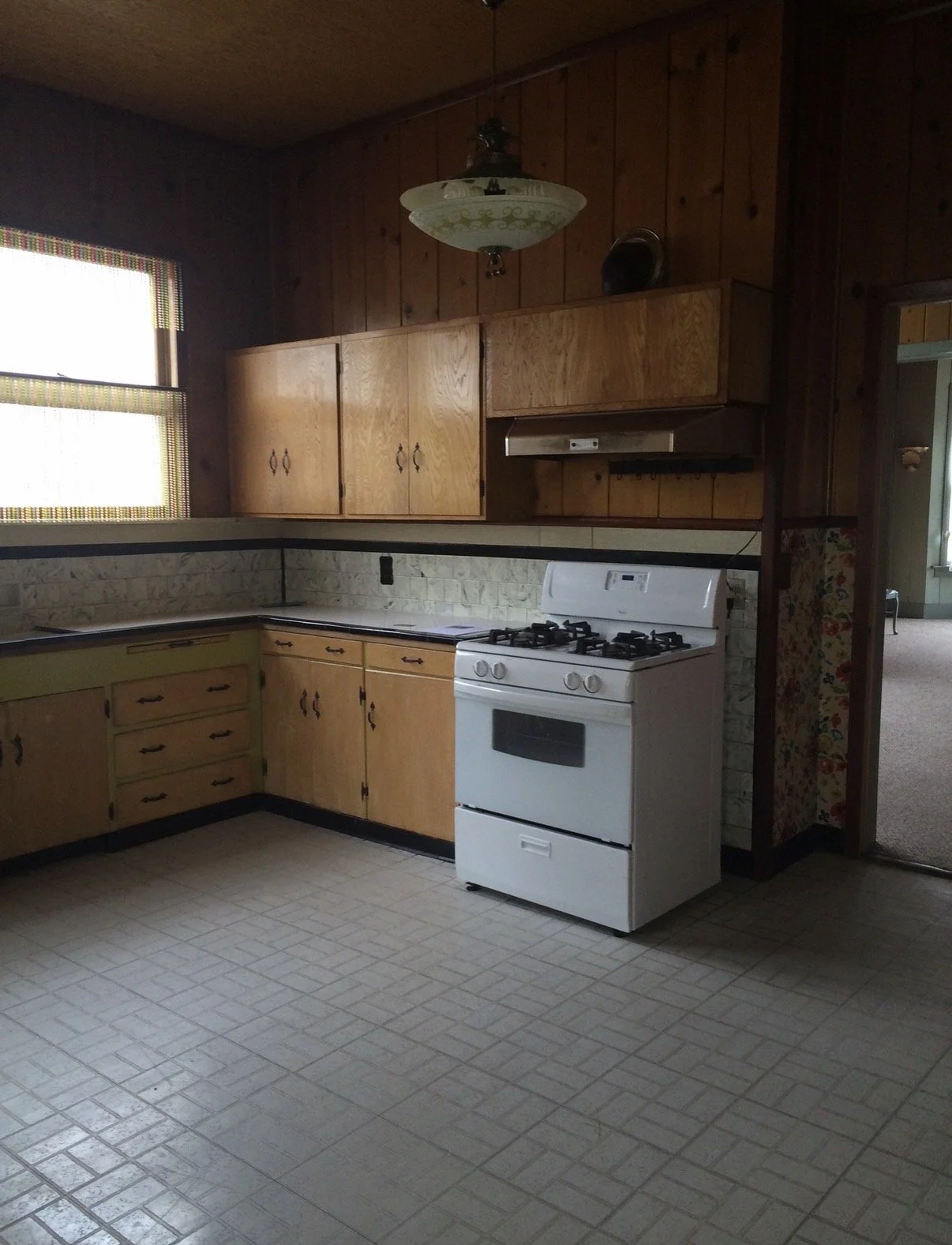
Painting it helped enormously. It opened everything up and made the space feel brighter and cleaner. We had big dreams for the room, but while we waited until we were ready to renovate, this made it a much nicer place to live in.
When the time eventually came to remodel, we got serious about figuring out how to put a completely new kitchen into a very old house and make it feel as though it belonged there.
We wanted all the ease of a modern kitchen- good storage, plenty of workspace, and appliances that made everyday life easier, but we also wanted it to have some of the character and old-world feeling of the house around it.
Getting the scale right
By the time we remodeled the kitchen, we had already learned how much scale matters in the house. With tall ceilings, so many things made for houses today simply look too small in the space. We also had the original details in other rooms to look to. The substantial moldings and their proportions gave us a sense of what the house could carry.
We wanted the kitchen to have that same sense of proportion, even though everything in it would be new. So we paid attention to it in both the big architectural choices and the smaller details.
From the beginning I wanted cabinetry to make use of the height of the room. Ideally, I would have taken the cabinets all the way to the ceiling, but that wasn’t practical, so the soffits bacame a compromise. They still allowed us to carry the cabinetry upward rather than leaving a large empty space above it. We used substantial molding to give the whole thing enough visual weight for the room and bring in some of the vintage character I wanted.
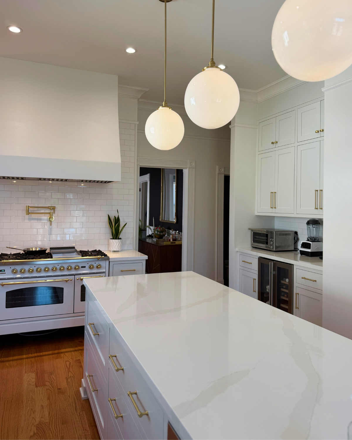
We carried other period details throughout the rest of the room, too. A picture rail gave us a natural place to end the subway tile rather than carrying it all the way to the ceiling. The tile rises a little more than halfway up the hood and meets the top of the molding around the large picture window, while the wall space above the picture rail creates some breathing room before the crown.
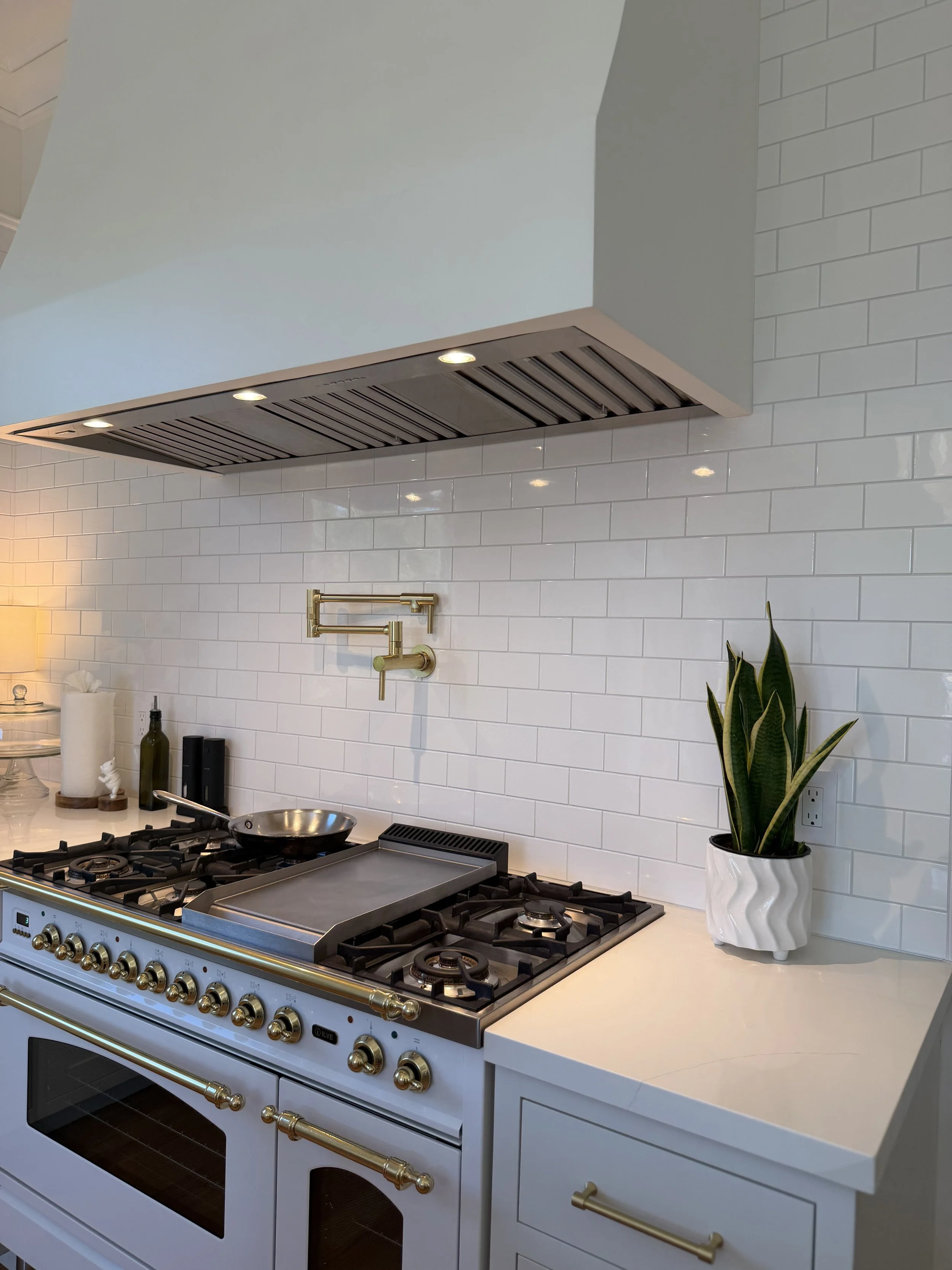
The hood actually started as a kit that was built out on site, and its size gives the cooking wall an architectural presence. Beneath it, the large white range feels substantial enough to belong there, while the brass pot filler and simple subway tile add just enough detail around it.
I chose white subway tile because it felt classic and uncomplicated, something I hoped I wouldn’t tire of in a few years. The cabinets are painted Swiss Coffee, a slightly warm off-white that gives just enough contrast against the true white of the tile and range.
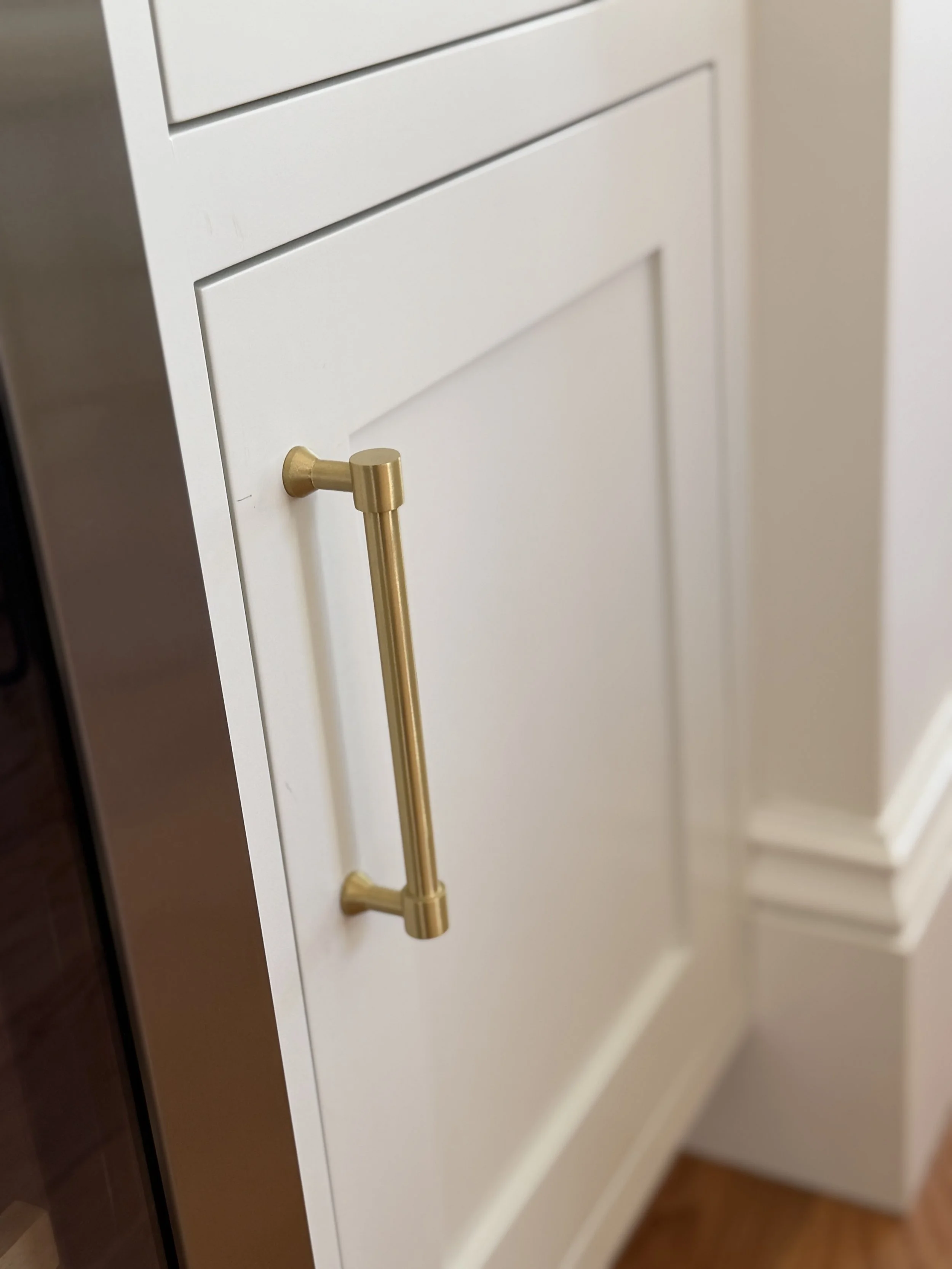
We also knew from the beginning that we wanted inset cabinetry. When we were studying kitchens for the renovation, it was a detail we kept noticing in older and more traditional kitchens. With the doors and drawers sitting flush inside their frames rather than on top of them, it had the more traditional look we wanted for the house.
We also made a conscious decision not to fill every available wall with cabinetry or shelving. It meant giving up some storage, but leaving space around the hood and the picture window helped preserve the open feeling we loved about the room in the first place. For us, the tradeoff has been worth it.
A view without interruption
Because the window over the sink needed to be moved during the renovation, we had the opportunity to rethink it entirely. I kept coming back to inspiration kitchens with big picture windows over the sink. I loved the openness of them and the way they brought in the light and made the view outside feel almost like part of the room. We finished it with wide fluted molding and oversized rosettes.
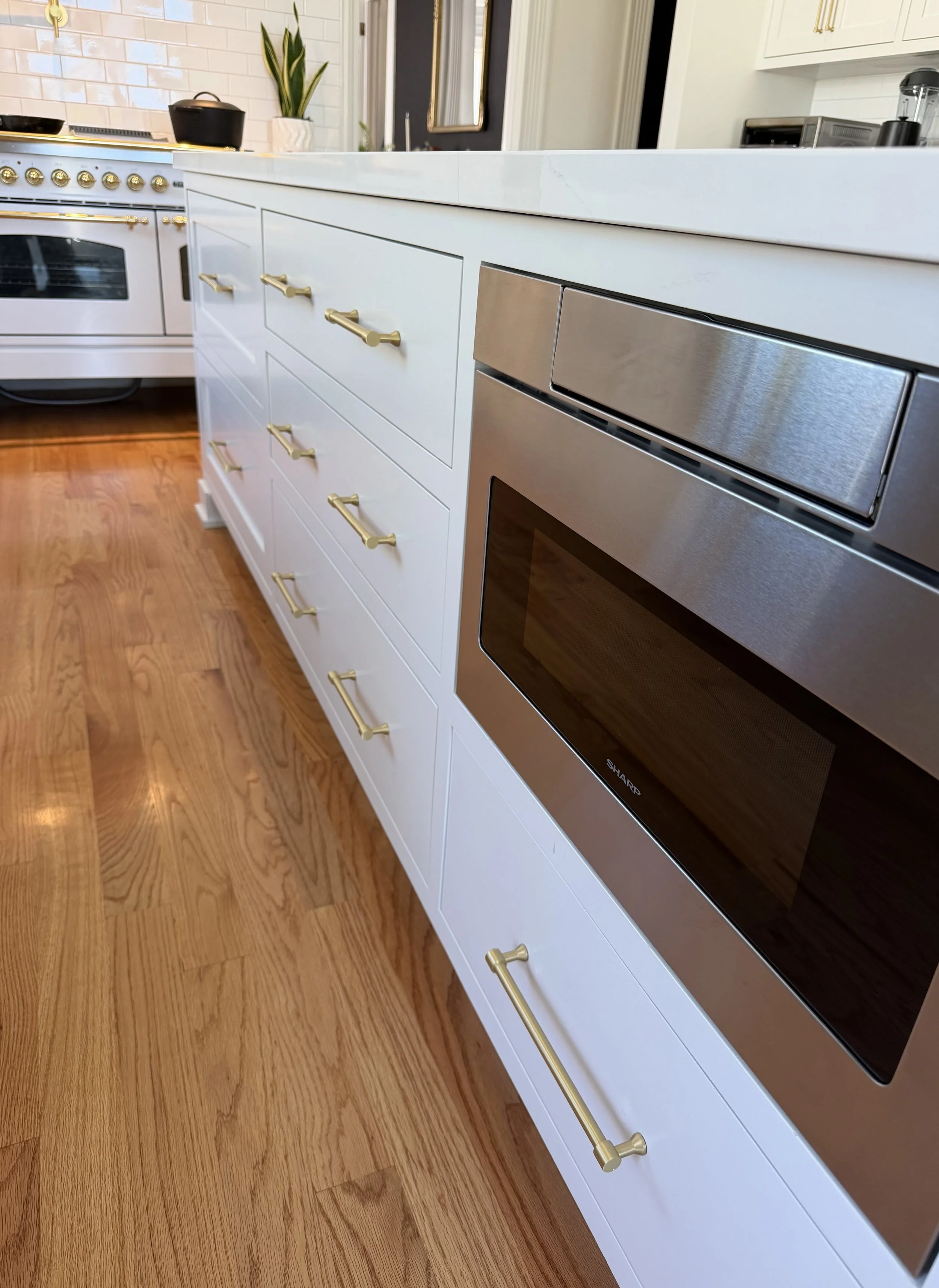
The island is enormous, and I love it
The island is topped with a marble looking quartz. I wanted the look of classic marble and its soft veining brings a bit of movement to the all white. It gives us a huge work surface, but maybe more importantly, it holds much of what we use every day. Dishes, utensils, and cooking supplies. The dishwasher sits directly across from it, so putting everything away takes only a pivot. It’s one of those practical details that makes the kitchen so easy to live with.
The light matters
Above the island, we chose three hand blown glass pendants that we found on Etsy. I loved that they had a slightly old fashioned quality while still feeling clean and current, almost a modern Victorian feel. Globe pendants aren’t unusual, but these with their beautiful glass and just enough detail, make them feel special. When they’re on, they give off a beautiful warm glow.
I’m actually a little obsessed with lighting. I’m always noticing when it’s too harsh or too cold. With so much white in the kitchen, I wanted the lighting to feel warm.
I like having light at different levels throughout the room. The recessed lights overhead give us the practical light we need, the lights beneath the hood illuminate the tile and range, and I love the warmth they bring to that side of the room.
And then there’s the little lamp in the corner.
My husband wasn’t entirely convinced at first that a kitchen needed a lamp. I was. I turn it on almost every morning, even when I don’t actually need the light, simply because I love the way the kitchen feels when it’s glowing.
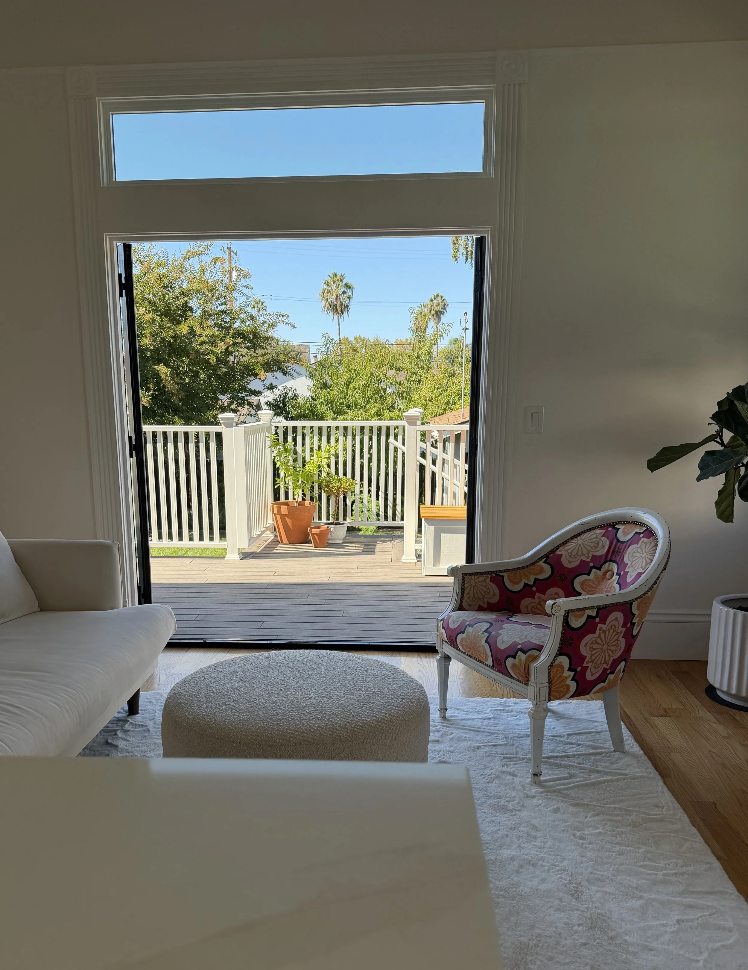
I also love that the kitchen doesn’t simply end. It moves into a seating area and from there, through French doors onto the deck, overlooking the garden. The doors and the transom above them bring so much natural light into the room, and when the doors are open, the whole space seems to stretch a little farther, bringing some of that open, outdoor feeling inside.
The luxury of ease
For years, our old kitchen didn’t have a dishwasher or even a garbage disposal. Everything was washed by hand, and there wasn’t much workspace or storage. For a house built in 1900, we were perhaps taking historical authenticity a little too far.
Maybe that’s partly why this kitchen still feels like a dream to me. Even after living with it for a while, I don’t take it for granted. I still notice how good it feels to walk into this room in the morning, turn on the little lamp and have a kitchen that is both beautiful and easy to live in.
We wanted the new kitchen to feel at home in this old house. Paying attention to its scale, borrowing from its architecture, and choosing things simply because we love them helped it find its place here.
It feels completely like home.